

TL;DR:
- A mobile-optimised website reduces the bounce rate and increases conversions.
- Page load speed and responsive design are essential for an effective user experience.
- Using free tools helps you diagnose and improve the mobile version of your website.
Every day, thousands of potential customers open their browser on their smartphone and search for a product or service like yours. If your website takes more than three seconds to load, 53 per cent of them They’ll leave your site before they’ve even seen what you have to offer. This isn’t just a hypothetical scenario: it’s how users will actually behave in 2026. Many small and medium-sized Italian businesses continue to treat mobile optimisation as a cosmetic detail, something to sort out “when there’s time”. In reality, a website that isn’t optimised for smartphones is a real obstacle to sales, reputation and visibility on Google. In this article, you’ll discover why mobile has become the primary channel, what benefits an optimised website brings, which technical elements are essential, and how to assess your website’s current situation straight away.
Contents
- Why mobile has changed the rules of corporate web
- Tangible benefits of a mobile-friendly website for SMEs
- The technical cornerstones of a mobile-friendly website: what you can’t do without
- Optimising speed for a mobile experience with no waiting
- How to evaluate and improve your website: tools and strategies for SMEs
- Why the majority underestimate mobile (and how SMEs can make the most of it)
- Do you want a website that converts on mobile too? Here’s how we can help you
- Frequently Asked Questions
Key Points
| Full stop | Details |
|---|---|
| Mobile is the new normal | Most users browse and shop on their smartphones: ignoring this means losing customers. |
| A mobile-friendly website reduces bounce rates | 53 per cent of users immediately leave a website that loads slowly or is not optimised. |
| SEO and reputation benefits | A mobile-friendly website improves Google rankings and brand perception. |
| Technique and strategy go hand in hand | Responsive design, optimised images and speed are essential for achieving tangible results. |
| Take action now so you don’t fall behind | Making a website mobile-friendly is a key competitive priority for any modern business. |
Why mobile has changed the rules of corporate web
In recent years, the smartphone has become the primary device people use to connect to the internet. This is not a passing trend: it is a structural shift in the way people search for information, compare products and make purchasing decisions. In Italy, over 60 per cent of web traffic comes from mobile devices, and this figure is rising every year.
Users browsing on smartphones behave very differently from those using a desktop computer. They are often on the move, have less patience, expect immediate responses and will leave any site that causes friction without hesitation. A menu that’s difficult to tap, text that’s too small to read, images that spill off the screen: each of these issues results in a lost user.
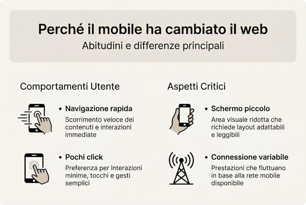
The features of a corporate website Effective websites have evolved precisely to cater for these new habits. A website designed solely for desktop use is no longer sufficient, however visually appealing it may be. The mobile user experience has become the key benchmark for measuring a website’s quality.
One of the most important indicators is the bounce rate, i.e. the percentage of users who leave the site after visiting just one page. With a mobile-friendly site, the bounce rate is reduced by 50 per cent: this means that more users stay, browse and potentially make a purchase.
Here are the main differences between a traditional desktop website and a mobile-friendly one:
| Feature | Desktop-only website | Mobile-friendly website |
|---|---|---|
| Layout | Fixed, it doesn’t fit | Smooth, adapts to the screen |
| Mobile speed | Often slow | Optimised for 4G/5G connections |
| Navigation | Complex menus | Simplified, touch-friendly menus |
| Lyrics | Fixed dimensions | Scalable and legible on any screen |
| Google Ranking | Restricted on mobile devices | Favoured by the mobile-first algorithm |
Watch the examples of optimised websites Mobile-first design helps us understand in practical terms how a responsive layout improves the user experience across all sectors. It’s not just about “squeezing” content onto a small screen: it’s about rethinking the hierarchy of information, the size of buttons and the speed of response.
If your current website does not meet these criteria, now might be the right time to consider When to revamp your website. Waiting means missing out on real opportunities every day.
“A website that isn’t optimised for mobile isn’t just aesthetically outdated: it’s an active barrier to the growth of your business.”
Tangible benefits of a mobile-friendly website for SMEs
Switching to a mobile-friendly website is not an expense: it is an investment with measurable returns. The benefits extend across a number of areas and accumulate over time, creating a positive impact on the company’s entire digital ecosystem.

More conversions, more customers. A mobile-friendly website directly improves the user experience and conversion rates. When a user can navigate the site easily, find the information they are looking for and complete an action (such as making a call, making a purchase or requesting a quote) without frustration, the likelihood of them converting increases significantly. Industry studies show that companies with mobile-optimised websites achieve conversion rates up to 160 per cent higher than those with non-responsive websites.
Reputation and trust. A website is often the first point of contact between a business and a potential customer. A website that looks poor on a smartphone conveys a lack of care, even if the company is excellent in its sector. Conversely, a well-designed and responsive mobile site conveys professionalism and reliability – two fundamental values for Italian SMEs operating in competitive markets.
A tangible SEO benefit. Since 2019, Google has been using the so-called mobile-first indexing: this means that the search engine evaluates and ranks websites primarily on the basis of their mobile version, not their desktop version. Understanding the’the importance of web design It also means understanding that a website that is not optimised for mobile devices is penalised in search results, regardless of the quality of its content.
Here is a direct comparison between the typical results of an optimised website and a non-optimised one:
| Indicator | Website not optimised | Mobile-friendly website |
|---|---|---|
| Bounce rate | 70-80% | 35-45% |
| Average time spent on the website | Less than 30 seconds | 2–4 minutes |
| Conversion rate | 0,5-1% | 2-4% |
| Google ranking (mobile) | Page 2 or later | Top positions |
| Perceived trust | Low | High |
Follow the web design tips A mobile-first approach means working on all these metrics simultaneously, using an integrated approach that delivers lasting results.
Pro tip: To quickly check whether your website is mobile-friendly, use Google’s free test: search for “Google Mobile-Friendly Test” and enter your website’s URL. In just a few seconds, you’ll get a clear result and a list of issues to fix.
The technical cornerstones of a mobile-friendly website: what you can’t do without
Knowing that a website needs to be mobile-friendly is one thing. Understanding what makes it so, from a technical point of view, is quite another. You don’t need to become a developer, but understanding the key concepts will enable you to make informed choices and communicate more effectively with those who build or update your website.
The foundation of it all is the responsive design, a design approach in which the website’s layout automatically adapts to the size of the screen on which it is displayed. It is not a question of creating different versions of the website for each device: it is a question of building a single website capable of reorganising itself intelligently.
This result is achieved thanks to technical tools such as media queries (CSS rules that apply different styles depending on the screen width), CSS Flexbox e CSS Grid (layout systems that allow page elements to reposition themselves fluidly). As indicated by the best practices for mobile-first design, responsive design, media queries, Flexbox, Grid and loading times of under 3 seconds are the key techniques for ensuring a high-quality mobile experience.
Another critical factor is the optimised images. Images are often the main cause of a website running slowly on mobile devices. Two key techniques:
- srcset: allows the browser to automatically select the image size best suited to the screen, preventing huge images from being loaded on small screens.
- Lazy loading: images are only loaded when the user is about to view them, reducing the initial page load time.
Here is a checklist of the technical elements that are essential:
- Responsive layouts using CSS Flexbox or Grid
- Media queries to adapt styles and fonts to different screen resolutions
- Images optimised with srcset and lazy loading
- Buttons and links with a minimum size of 44×44 pixels (touch standard)
- Fonts that are legible without zooming (minimum 16px)
- No use of Flash or technologies not supported on mobile devices
- Loading speed under 3 seconds
- Regular testing on real devices, not just emulators
For WordPress users, follow the Successful WordPress strategies When it comes to responsive themes and optimisation plugins, this makes the job much easier, as many of these features are already built into modern themes.
Pro tip: Pay attention to touch accessibility: links that are too close together on mobile devices can lead to accidental clicks and frustration. Always ensure there is adequate spacing between interactive elements and test the site using your fingers, not just a mouse.
Optimising speed for a mobile experience with no waiting
Loading speed is perhaps the most critical factor in the mobile experience. Smartphone users are used to speed and are not as patient as those browsing on a desktop with a fibre connection. Every extra second of waiting time comes at a real cost to your business.
53 per cent of users leave a website if it takes longer than 3 seconds to load. And it’s not just about users leaving: Google considers loading speed to be a direct ranking factor, so a slow website loses visibility in search results.
Here are the actual figures on the impact of speed:
| Loading time | Estimated drop-out rate |
|---|---|
| 1–2 seconds | 9% |
| 3 seconds | 32% |
| 5 seconds | 90% |
| 10 seconds | Over 95 per cent |
How can you actually reduce loading times? These are the most effective steps:
- Image compression: Use modern formats such as WebP instead of traditional JPEG or PNG. For the same visual quality, WebP images are up to 30 per cent smaller.
- Caching: Caching (temporary storage) allows the browser to save website resources locally, so subsequent visits are much faster. Plugins such as WP Rocket or W3 Total Cache handle this aspect on WordPress.
- High-quality hosting: A slow server is an obstacle that no amount of code optimisation can fully compensate for. Choosing a hosting provider with servers in Italy or Europe reduces the TTFB (Time To First Byte), which is the time between the browser’s request and the server’s first response.
- CSS and JavaScript minification: Reducing the size of code files removes unnecessary spaces and characters without affecting how the website works.
- Content Delivery Network (CDN): distributes the website’s resources across servers around the world, bringing the files closer to the user and reducing response times.
Follow the WordPress best practices In terms of speed, this means applying these techniques systematically, using tried-and-tested, reliable tools.
How to evaluate and improve your website: tools and strategies for SMEs
Before taking any action, it is essential to understand exactly where your website stands. The good news is that there are free and accurate tools available that allow you to carry out a comprehensive assessment without needing advanced technical skills.
As outlined in the best practices for mobile-first design, using mobile testing tools and implementing the suggested fixes is the starting point for any improvement strategy.
Here’s how to do it, step by step:
- Google Mobile-Friendly Test: go to search.google.com/test/mobile-friendly and enter your website’s URL. The tool will tell you whether Google considers your site to be mobile-friendly and will highlight any specific issues.
- Google PageSpeed Insights: available at pagespeed.web.dev, it analyses website speed on both mobile and desktop devices and provides a score from 0 to 100. Aim for a score of over 70 on mobile.
- Read the results carefully: Both tools provide a list of issues, ranked by priority. Focus first on the issues classified as “high impact”.
- Tackle the simplest corrections: You can carry out certain optimisations, such as image compression or enabling caching, even without a developer, by using specific plugins if the site is built on WordPress.
- Testing on real devices: Use your own smartphone and someone else’s with a different model to browse the site as a real user would. This often reveals issues that automated tools fail to detect.
Follow the practical web design tips During this phase, it helps you to keep in mind the aesthetic and functional aspects that influence the overall user experience.
Pro tip: If your PageSpeed results show scores below 50 on mobile, or if the Mobile-Friendly Test flags more than three critical issues, it’s time to call in a professional. Some optimisations require changes to the code which, if done incorrectly, can make the situation worse.
Why the majority underestimate mobile (and how SMEs can make the most of it)
There is a widespread belief amongst many Italian business owners: “My website works; customers can still find me.” It’s an understandable, but dangerous, stance. The problem isn’t what you see when you browse the website from your computer in the office. The problem is what your potential customer sees when they search for you on their smartphone whilst on their lunch break or waiting for a train.
Many people think that mobile is “just about aesthetics”, a question of how the website looks. In reality, the mobile experience is the main gateway to your digital business. A website that’s slow or difficult to use on a smartphone isn’t just a technical problem: it sends an implicit message to the customer saying, “we’re not ready to welcome you”.
The uncomfortable truth is that companies that have already invested in mobile optimisation are reaping the rewards in terms of visibility, traffic and conversions. Those who wait find themselves playing catch-up, rather than competing.
Considering a website redesign does not mean throwing away what you have built: it means adapting it to the demands of today’s market. Mobile is not the future of the web. It is the present. And taking action now, with awareness and a systematic approach, is the most practical step you can take to grow your business.
Do you want a website that converts on mobile too? Here’s how we can help you
If you’ve read this far, you already have a clear idea of what it takes to make your website truly effective on mobile devices. The next step is to turn this understanding into concrete action. With over 20 years’ experience in building websites for Italian SMEs, I can guide you through every stage: from analysing the current situation, to website redesign workflow, right through to SEO optimisation and the creation of high-conversion landing pages.
Every project begins with a bespoke analysis, because every business has different needs. If you want to improve the SEO optimisation for businesses or do you need a professional landing page design For a specific campaign, you’ll find bespoke solutions, with no off-the-shelf packages. Contact me for a free initial consultation and find out what we can do for your website.
Frequently Asked Questions
How much does it cost to make your website mobile-friendly?
The cost varies depending on the complexity of the project, but a good redesign can often start from a few hundred euros and go up to a few thousand for more advanced work that includes SEO optimisation and speed optimisation.
What are the signs that my website is NOT mobile-friendly?
Difficult navigation, text that’s too small, images that spill off the screen and a high bounce rate on smartphones are the most common signs. Remember that 53 per cent of users abandon a slow website: if your Analytics data shows very short mobile sessions, that’s probably where the problem lies.
Does a mobile-friendly website really improve your Google ranking?
Yes, directly. Google uses mobile-first indexing, so it evaluates and ranks websites primarily on the basis of their mobile version. An SEO advantage for mobile-friendly websites translates into higher rankings in smartphone searches, where the majority of searches take place.
What is the difference between a mobile-friendly website and an app?
A mobile-friendly website can be browsed via a browser on any device without the need to install anything, as it automatically adapts to the screen. An app, on the other hand, requires installation, separate updates and dedicated development resources: it is a suitable choice only in specific cases.
How long does it take to make an existing website mobile-friendly?
Depending on the existing architecture and the extent of the work required, the process can take from a few days for a simple site up to a few weeks for more complex projects involving advanced optimisations.