Many visitors leave a homepage if it is not clear and professional, thereby jeopardising business opportunities. An effective homepage measurably increases customer numbers and online visibility. This guide explains how to design a homepage that converts, tailored for Italian entrepreneurs and freelancers who want to strengthen their digital presence.
Contents
- Prerequisites and tools required to design a professional homepage
- Preliminary analysis and definition of the homepage’s objectives
- User-centred UX design
- Specific SEO optimisation for the homepage
- Implementing effective calls to action
- Expected results and success metrics for the homepage
- Common mistakes and how to avoid them when designing a homepage
- Discover our professional services for creating your website
Key points
| Full stop | Details |
|---|---|
| Knowledge and tools | You’ll need a basic understanding of web design, SEO and tools such as WordPress to get off to a successful start |
| Objectives and targets | Defining a specific target audience and measurable objectives ensures effective design choices |
| UX and optimisation | Responsive design, accessibility and technical SEO reduce bounce rates and improve search engine rankings |
| Strategic calls to action | CTAs that are visible and correctly positioned can increase conversions by up to 25% |
| Success metrics | Monitoring bounce rates, time spent on site and conversions enables you to assess concrete results |
Prerequisites and tools required to design a professional homepage
To get your homepage project off to a successful start, you need a basic understanding of web design and SEO. Familiarity with the principles of usability, visual hierarchy and search engine optimisation will enable you to make informed decisions. You don’t need to be an expert, but understanding the basics makes all the difference between an effective homepage and one that’s all over the place.
Recommended tools include WordPress, the most widely used CMS, which offers flexibility and ease of use for SMEs and professionals. WordPress is very widely used among Italian companies precisely because of its versatility. Design software such as Figma or Adobe XD helps to create prototypes before the actual development begins. These tools allow you to visualise the final look and make changes at no extra cost.
The average budget for a professional website ranges from 1,500 to 4,500 euros, including design, development and initial SEO optimisation. Lower investments often lead to mediocre results that do not generate a return on investment. For more details on the costs involved, see the guide on the cost of setting up a website which analyses specific expenditure items.
Pro tip: Allow for an additional 15–20% in your budget to cover unforeseen issues and customisations that arise during development.
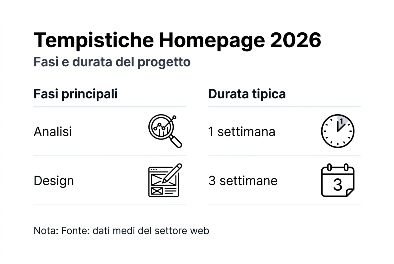
A realistic timeframe for completing a professional homepage is between 4 and 8 weeks. This includes preliminary analysis, UX design, development, testing and optimisation. Rushing the process compromises quality and results. The Professional website creation in 10 steps provides a detailed roadmap of the stages.
| Resource | Type | Approximate cost | Time required |
|---|---|---|---|
| WordPress | CMS | Free | 1–2 days’ set-up |
| Premium theme | Design | 50–100 euros | Immediate |
| SEO plugin | Optimisation | Free – 200 euros | 1-day configuration |
| Developer | Customisation | 1,500–4,000 euros | 3–6 weeks |
Having outlined what is required, we can now proceed to define the homepage’s objectives and target audience in detail.
Preliminary analysis and definition of the homepage’s objectives
Defining your specific target audience is the first strategic step. You need to know exactly who will be visiting your homepage: their age, profession, needs and online behaviour. A website for architects requires a different approach to one for tax advisers. Creating detailed buyer personas helps you tailor your messaging and design.
Setting measurable goals such as conversions, qualified leads or brand awareness transforms the homepage from a static showcase into a business tool. Do you want 50 contact enquiries a month? To increase newsletter sign-ups by 30%? Vague goals produce vague results. The features of a professional website always include clear success metrics.
Gathering data on competitors and users provides valuable insights to help you stand out. Analyse the homepages of your direct competitors: what works, what’s missing, and how they rank. Tools such as SimilarWeb or SEMrush reveal competitors’ traffic and keywords. Interview current customers to understand what they’re looking for when they visit websites in your sector.
- Identify 3–5 direct competitors and analyse the structure of their homepages
- Gather feedback from at least 10 current customers about their expectations
- Use Google Analytics to analyse user behaviour on an existing website
- Identify 2–3 key performance indicators (KPIs) to monitor on an ongoing basis
The importance of KPIs in assessing success cannot be underestimated. Bounce rate, time on page, conversion rate and keyword ranking are essential metrics. Without defined KPIs, you cannot know whether your investment is paying off. Set baseline figures before launch and monitor weekly improvements.
Now that we have defined our objectives and targets, let’s move on to designing a user-centred experience.
User-centred UX design
A clear and simple layout reduces homepage bounce rates by up to 38%. Users decide within 3–5 seconds whether to stay or leave. A well-defined visual hierarchy guides the eye towards key elements: the value proposition, core services and contact details. Avoid overloading the page with too many elements that distract from the core message.
Responsive and mobile-friendly design is essential in 2026. Mobile-friendly design is crucial to avoid losing up to 50% of potential traffic. Google prioritises indexing mobile versions, so the homepage must work perfectly on smartphones. Testing on real devices reveals issues that are not visible on desktops.

Accessibility for users with disabilities increases engagement by 20% and broadens the potential audience. Adequate colour contrast, alternative text for images and keyboard navigation are basic requirements. In addition to ethical considerations, accessibility improves SEO and overall usability. Our 10-step guide to creating professional websites incorporates accessibility as standard.
The choice of colours, fonts and spacing directly affects readability and the time users spend on the page. Sans-serif fonts such as Open Sans or Roboto ensure readability on screens. Generous spacing between elements reduces eye strain. The colour palette should reflect the brand whilst prioritising contrast and clarity.
- Use a maximum of 2–3 fonts to maintain visual consistency
- Ensure a minimum contrast ratio of 4.5:1 between text and background
- Minimum body text font size: 16px for mobile readability
- Ample white space improves the readability of content
- Testing with real users prior to the final launch
Pro tip: Use heatmap tools such as Hotjar to see where users actually click and optimise the layout of elements accordingly.
Now that the UX has been designed, let’s focus on SEO optimisation and the technical performance of the homepage.
SEO optimisation specifically for the homepage
Keyword research tailored to the Italian market identifies terms that potential customers are actually searching for. Tools such as Google Keyword Planner or Ubersuggest reveal search volume and competition levels. Focusing on long-tail keywords specific to your sector increases the likelihood of conversion. Avoid overly generic keywords where competition is too fierce.
Loading times of under 3 seconds are essential for retaining users. Users’ 55% models are being phased out A website where the homepage takes more than 3 seconds to load. Optimised images, a correctly configured cache and high-performance hosting make a measurable difference. Every second saved increases conversions and improves Google rankings.
The correct use of meta tags, titles and ALT tags in images helps search engines understand the content and its relevance. Title tags should include the main keyword and be eye-catching to increase the click-through rate (CTR). A compelling meta description improves the number of clicks from search results. Descriptive ALT tags aid accessibility and the indexing of images.
- Include the main keyword in the title tag within the first 60 characters
- Meta description of between 150 and 160 characters with a clear call to action
- Use a single H1 heading with the primary keyword
- Descriptive yet concise image ALT tags
- A clean homepage URL that includes the brand name
| SEO element | Best Practice | Impact ranking |
|---|---|---|
| Title tag | Primary keyword + brand | High |
| Meta description | Clear CTA: 150–160 characters | Medium (CTR) |
| Loading speed | Under 3 seconds | High |
| Mobile-friendly | Responsive design | Critic |
| Markup schema | Structured business data | Medium |
The importance of technical SEO for rankings and usability includes an SSL certificate, an XML sitemap and a properly configured robots.txt file. Google penalises insecure websites, so HTTPS is mandatory. A logical URL structure facilitates crawling and helps search engines understand the site’s hierarchy. The website positioning and SEO explores advanced strategies.
Now that we’ve covered SEO optimisation, let’s look at how to include effective calls to action to boost conversions.
Implementing effective calls to action
The most effective types of CTAs for professionals include requests for quotes, booking consultations and downloading free resources. A CTA must promise immediate and clear value. “Request a free quote” converts better than “Contact us”. Tailor the message to the specific objective of the homepage.
The strategic placement of CTAs on the homepage follows the ‘above the fold’ principle and visual focal points. The first CTA, visible without scrolling, captures users who are ready to convert immediately. A secondary CTA halfway down the page captures those who need more information. The inclusion of visible calls to action Increases conversions on homepages by up to 25%.
A/B testing to optimise conversion rates involves comparing different CTA variants to identify the most effective one. Test the button colour, text, position and size. Even small changes can lead to significant variations. Collect data from at least 1,000 visitors per variant before drawing statistically valid conclusions.
- Contrasting colours for CTA buttons increase visibility
- Action-oriented text: “Get started now” is better than “Find out more”
- Sufficient size for mobile touch interaction (minimum 44×44 pixels)
- White space around the CTA to highlight it
- Limit yourself to 1–2 primary CTAs to avoid confusion
Pro tip: Use ethical urgency, such as “Limited places available for free consultations this month”, to boost immediate conversions without being pushy.
Clarity and directness in the message of CTAs eliminate decision-making friction. Users must understand instantly what will happen when they click. Avoid technical jargon or vague promises. The landing page creation Apply effective CTA principles to conversion-focused pages.
Now that the CTAs have been implemented, let’s move on to analysing the expected results and success metrics.
Expected results and success metrics for the homepage
The projected 40% SEO ranking improvement over three months is realistic with proper optimisation and high-quality content. Monitoring the rankings of target keywords reveals weekly progress. Gradual improvements are normal; sudden drops indicate technical issues that need to be resolved immediately.
A rise in turnover of up to 70% following a homepage redesign has been documented for SMEs that invest strategically. An effective homepage converts visitors into paying customers. ROI is measured by comparing project costs with the increase in revenue attributable to conversions from the homepage.
A bounce rate below 40% indicates relevant content and a satisfactory user experience. A high bounce rate suggests a mismatch between user expectations and the content provided. Analyse the pages with the highest bounce rates to identify specific issues.
- Ideal bounce rate: 30–40% for professional websites
- Average time spent on the page: target 2–3 minutes
- Conversion rate: 2-5% benchmark for B2B
- Organic traffic: quarterly growth of 20–30%
- Qualified leads: minimum increase of 40% following launch
An increase in the average time spent on the site by over 2 minutes suggests engaging content. Users who read the entire homepage are three times more likely to convert than those who leave straight away. Videos, infographics and interactive sections boost measurable engagement.
| Metric | Before the facelift | Post-refresh | Change |
|---|---|---|---|
| Bounce rate | 65% | 38% | -41% |
| Page time | 45 seconds | 2 mins 20 secs | +211% |
| Conversions | 1.2% | 3.8% | +217% |
| Average keyword position | 28 | 12 | +57% |
A comparison of pre- and post-project metrics demonstrates the effectiveness of the investment. Baseline screenshots taken before the launch provide an objective benchmark. The website redesign It analyses when and why to revamp an existing homepage.
Having described the ideal outcomes, we will now highlight the common mistakes to avoid so as not to jeopardise the project.
Common mistakes and how to avoid them when designing a homepage
Information overload reduces the time users spend on the 60% website because it causes confusion and paralyses decision-making. The homepage must communicate its core value within 5 seconds, rather than listing every service on offer. Focus on 3–5 key messages instead of 20 competitive selling points. Less really is more when it comes to effective communication.
Slow loading times cause users to abandon the 55% site before they even see the content. Unoptimised images, too many scripts and a slow server are the main culprits. Compress images using TinyPNG, use lazy loading, and minimise CSS and JavaScript. Run a speed test using Google PageSpeed Insights to identify specific bottlenecks.
A lack of mobile optimisation is a critical mistake in 2026, when over 60% of traffic comes from smartphones. A website that looks stunning on a desktop but is unreadable on a mobile device loses half its potential audience. A mobile-first design guarantees an excellent experience on every device. A professional website always features perfect responsiveness.
- Test the homepage on at least five different mobile devices
- Check text readability without zooming
- Ensures buttons are easy to click with your fingers
- Avoid intrusive pop-ups, which Google penalises
- Check that the form works on mobile devices
CTA buttons that are difficult to spot reduce conversions by around 25% because users cannot find a way to take action. Small buttons, colours that blend into the background and illogical positioning hide opportunities for conversion. CTAs must immediately catch the eye and clearly communicate the action to be taken.
A lack of clear objectives undermines strategies because every decision becomes arbitrary. Without knowing what you want to achieve, you cannot design an effective homepage. Define measurable objectives before you start designing. Every element of the homepage must support a specific objective.
Once the error analysis is complete, we move on to the promotional section, which offers professional solutions to assist with implementation.
Discover our professional services for creating your website
Progettare una homepage professionale che converte richiede competenze tecniche, esperienza strategica e tempo dedicato. Se preferisci affidarti a professionisti che conoscono ogni aspetto del processo, i servizi di freelance webmaster – website design offrono soluzioni personalizzate per PMI e liberi professionisti.

Oltre 20 anni di esperienza nel web development garantiscono homepage ottimizzate che aumentano visibilità e conversioni. Dalla progettazione UX all’implementazione tecnica, ogni dettaglio viene curato per massimizzare risultati. I servizi integrano posizionamento sito web e SEO per assicurare che la tua homepage raggiunga il pubblico giusto.
Supporto completo include analisi preliminare, design personalizzato, sviluppo su WordPress, ottimizzazione performance e monitoraggio risultati. Seguendo la metodologia della creazione siti web professionali in 10 passi, ottieni homepage che trasforma visitatori in clienti paganti.
Frequently Asked Questions
Come posso scegliere gli strumenti giusti per progettare la homepage?
Scegli CMS come WordPress per flessibilità e facilità d’uso, particolarmente adatto a PMI e professionisti. Utilizza software di design semplici come Figma per creare prototipi visuali prima dello sviluppo. La creazione siti web professionali in 10 passi guida nella selezione tecnologie appropriate.
Quanto tempo serve per vedere i risultati dopo aver progettato la homepage?
I risultati SEO diventano visibili tipicamente in 3 mesi con ottimizzazione costante e contenuti qualità. L’effetto sulle conversioni può essere immediato se le CTA sono efficaci e posizionate strategicamente. Monitoraggio settimanale delle metriche rivela progressi graduali e aree da ottimizzare.
Quali sono gli errori più comuni da evitare nella homepage?
Evita sovraccarico di contenuti che confonde visitatori e lentezza nel caricamento oltre 3 secondi. Non trascurare design mobile-friendly e CTA chiare visibili immediatamente. Mancanza di obiettivi misurabili compromette efficacia e rende impossibile valutare successo progetto.
Quanto budget devo prevedere per una homepage professionale?
Il budget medio varia tra 1500 e 4500 euro includendo design, sviluppo, ottimizzazione SEO e test. Investimenti inferiori spesso producono risultati mediocri senza ritorni misurabili. Pianifica ulteriore 15-20% per personalizzazioni e imprevisti che emergono durante sviluppo.